Table booking made easy
Make reservations and pre-order food
User pain points
What users are demanding
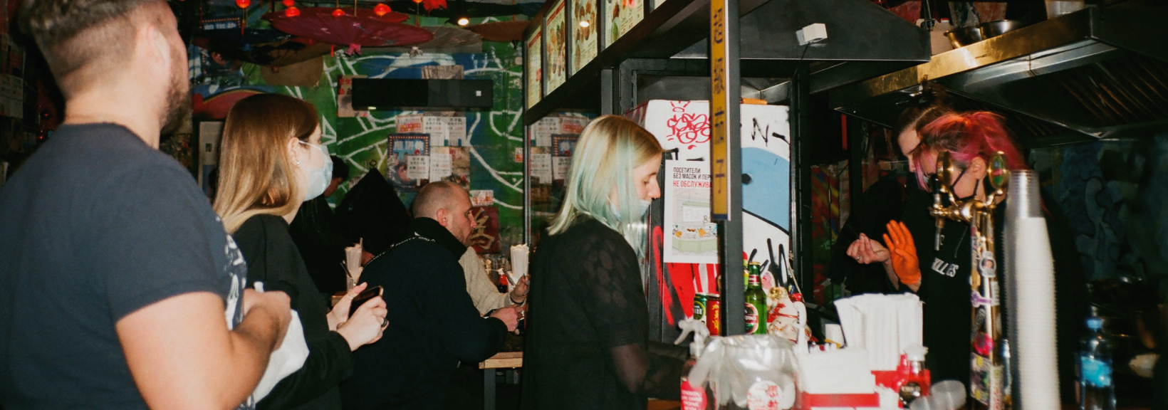
Mobility
I can't find the right restaurant for the evening with free seats

Expectation
I have to wait half an hour for the food to be cooked and brought
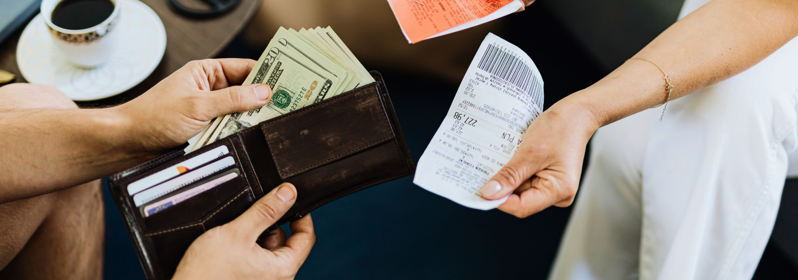
Unknown
I want to know the total amount in advance and pay by card
How it works
-
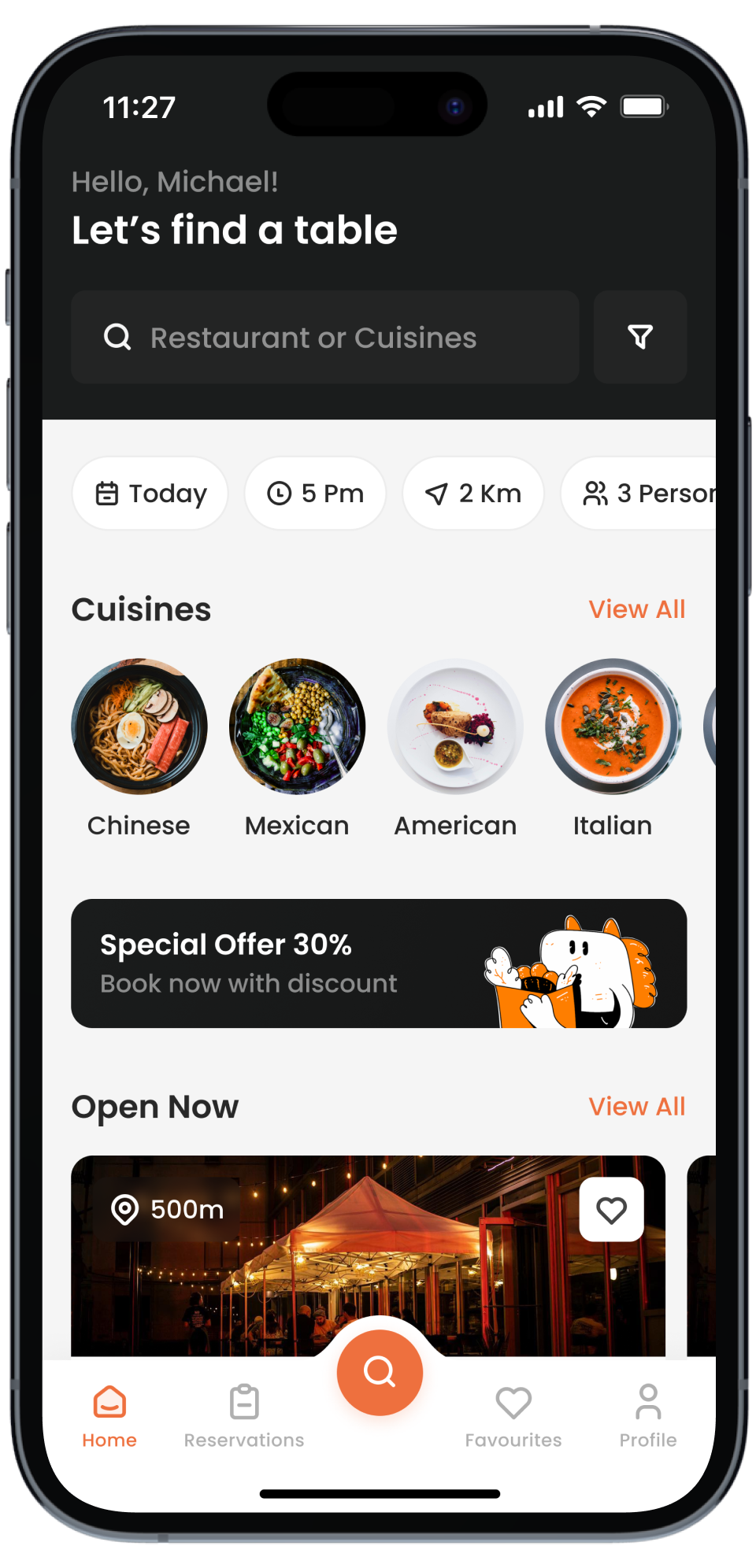
Select a restaurant
-
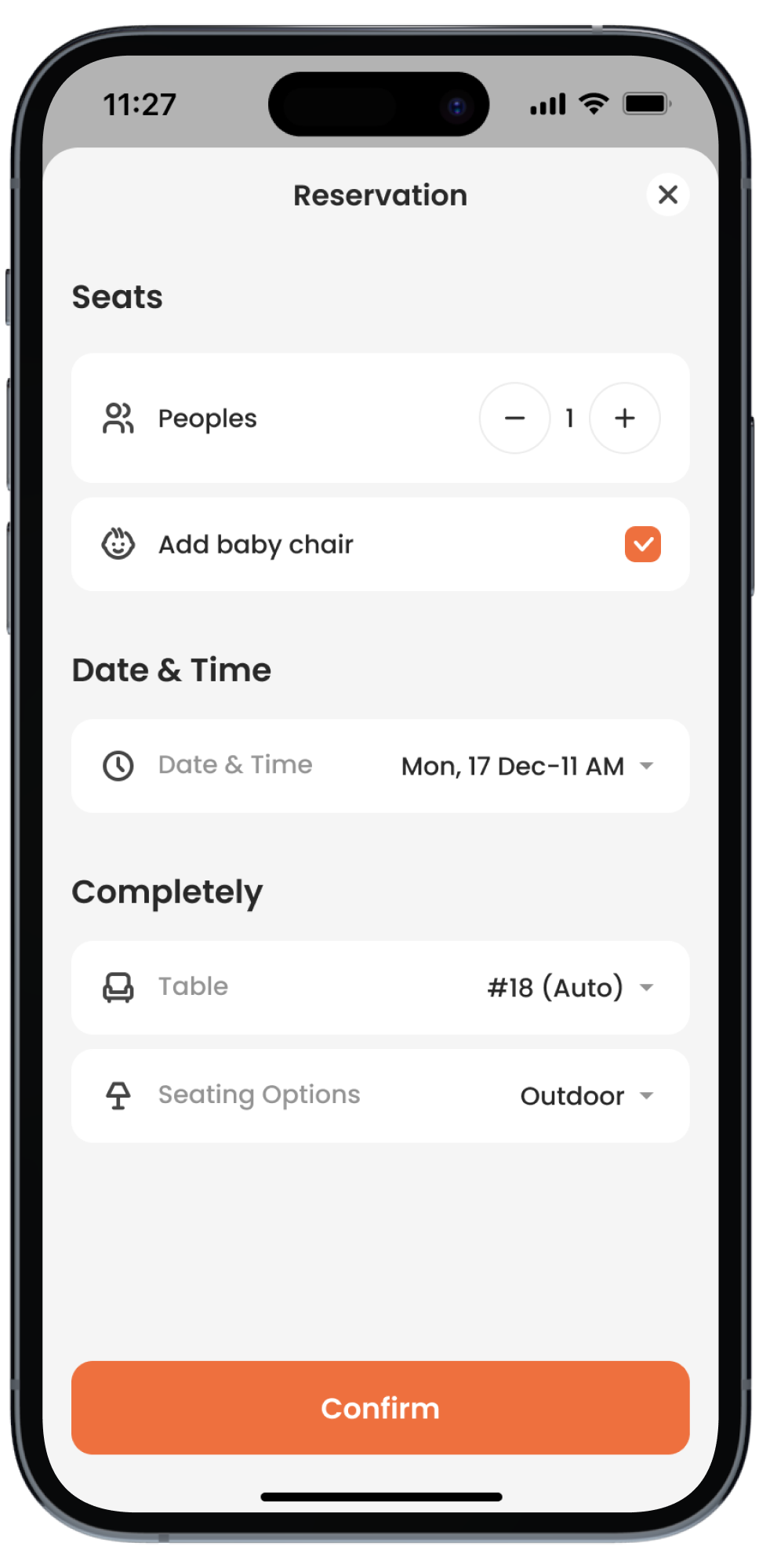
Reserve a table
-
Pre-Order Dishes
-
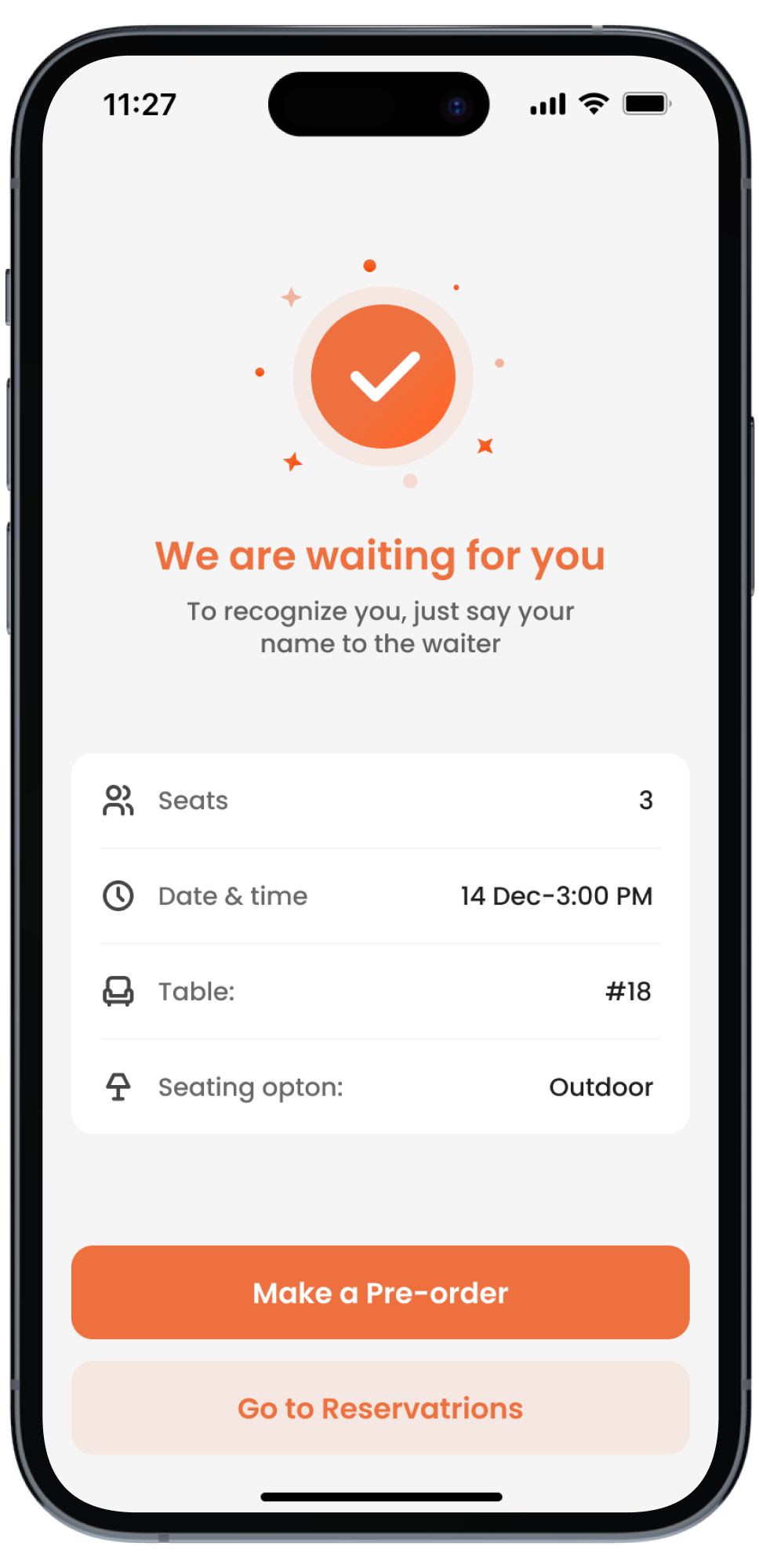
Come for the already-cooked meal
Home & Search
After several user surveys, we chose only the most essential home screen elements users paid attention to.
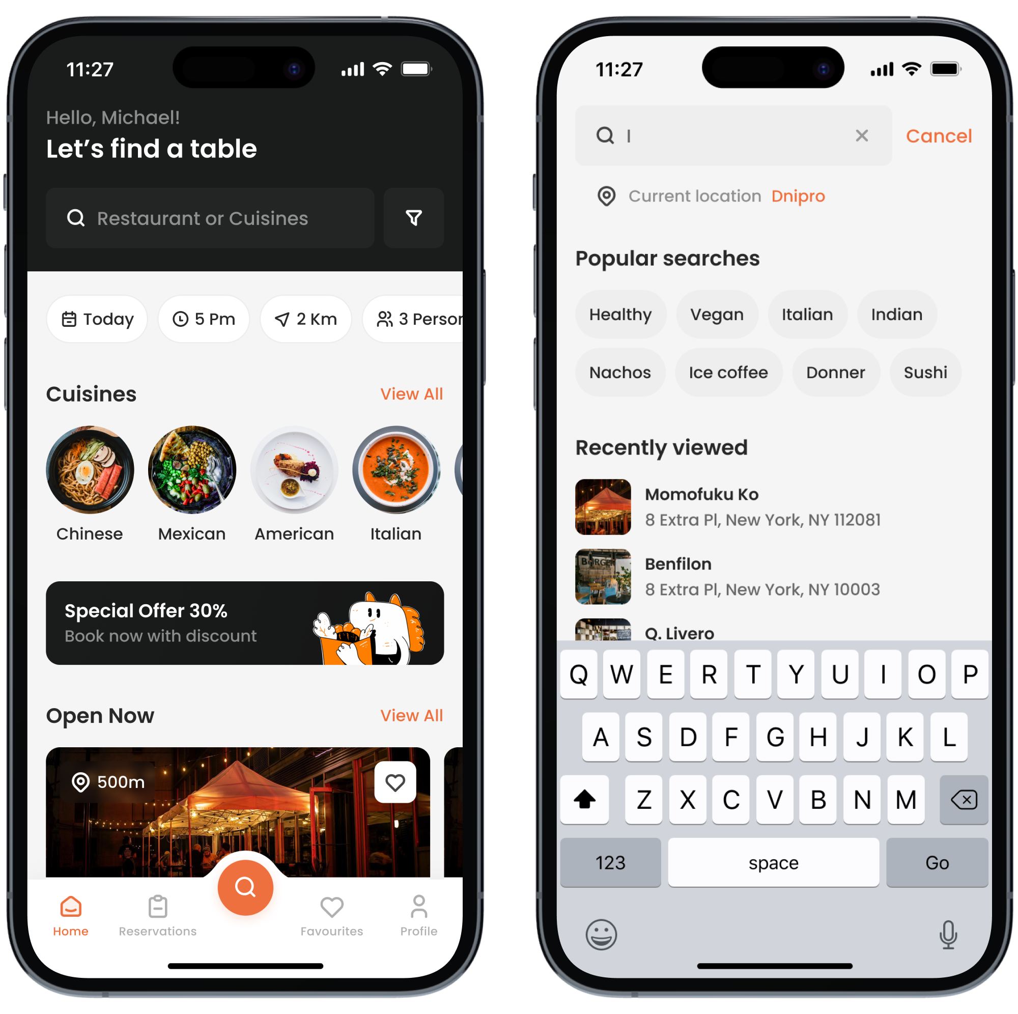
Choose restaurants by rating, cuisine, and prices
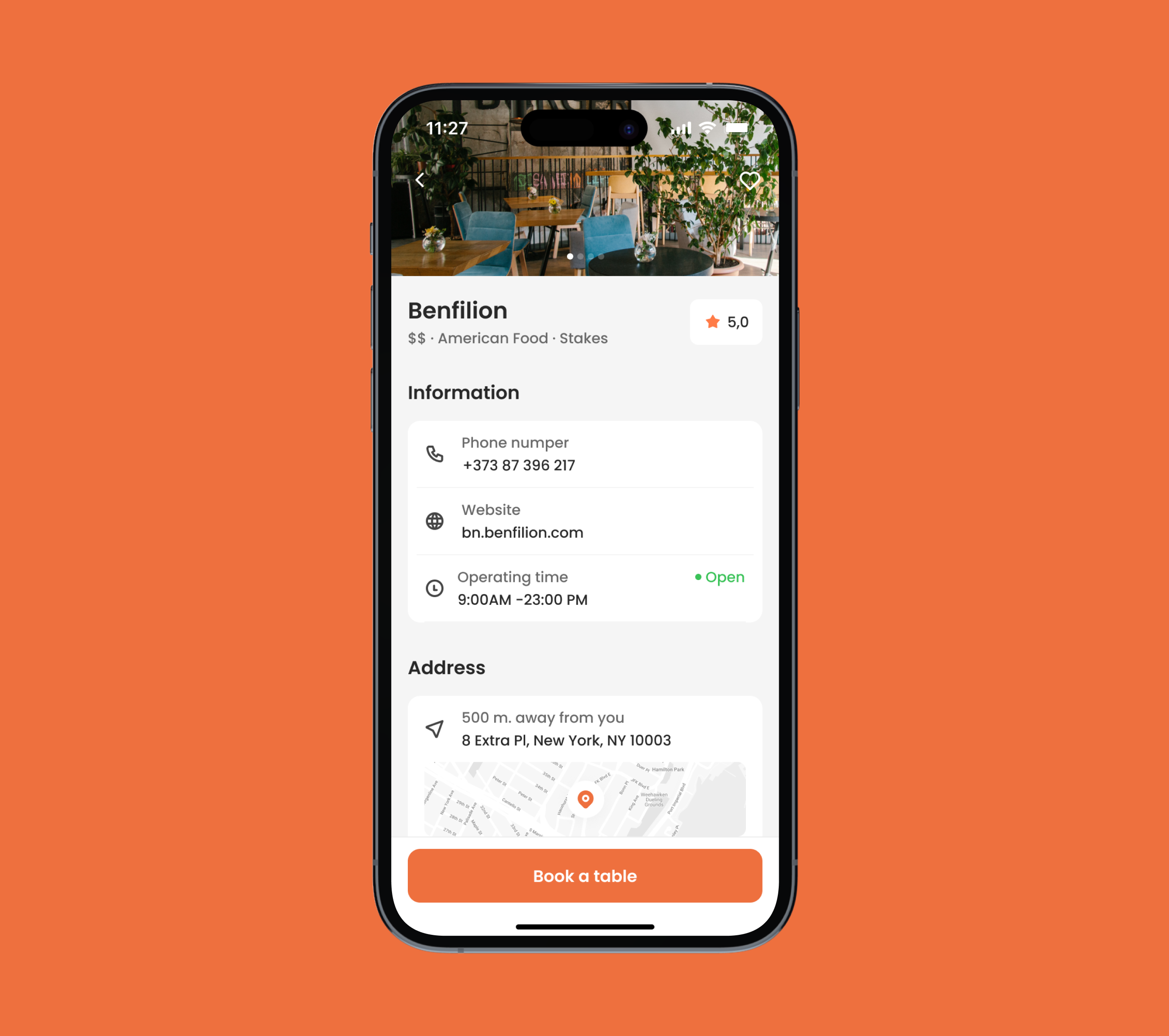
Read all the information about a restaurant
Restaurant Details
On the restaurant page you can see only the most important information about the reservation. Through it you can preview the restaurant menu

-
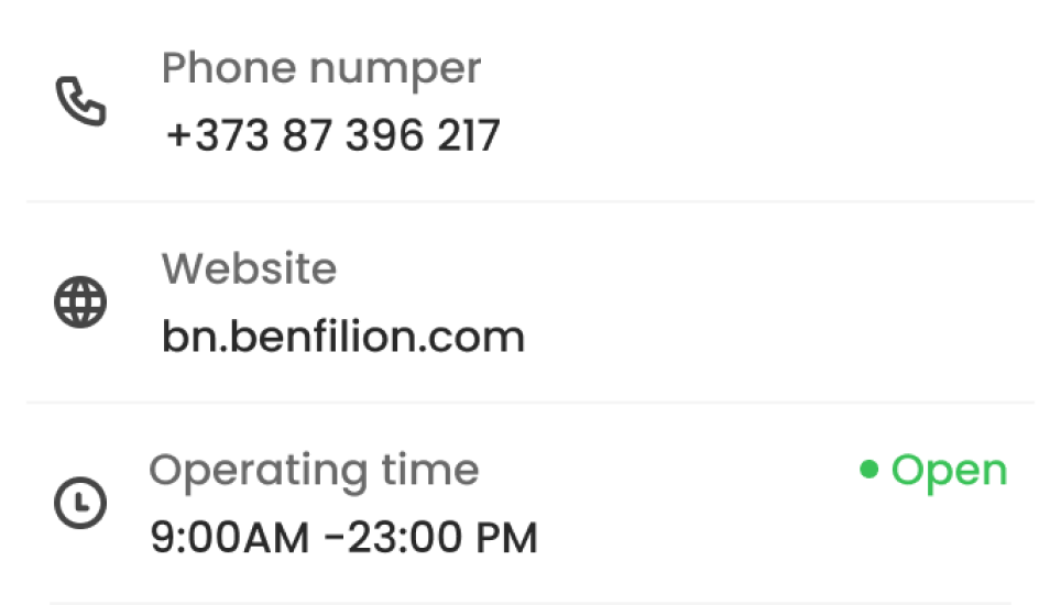
Contact Information
Find out about the restaurant opening hours and see their contacts
-
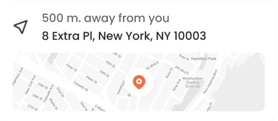
Location
Find out how far away the restaurant is from you and create a route
-
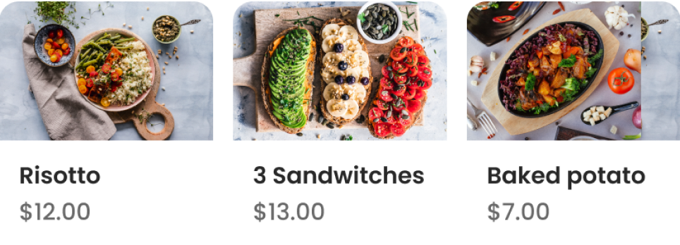
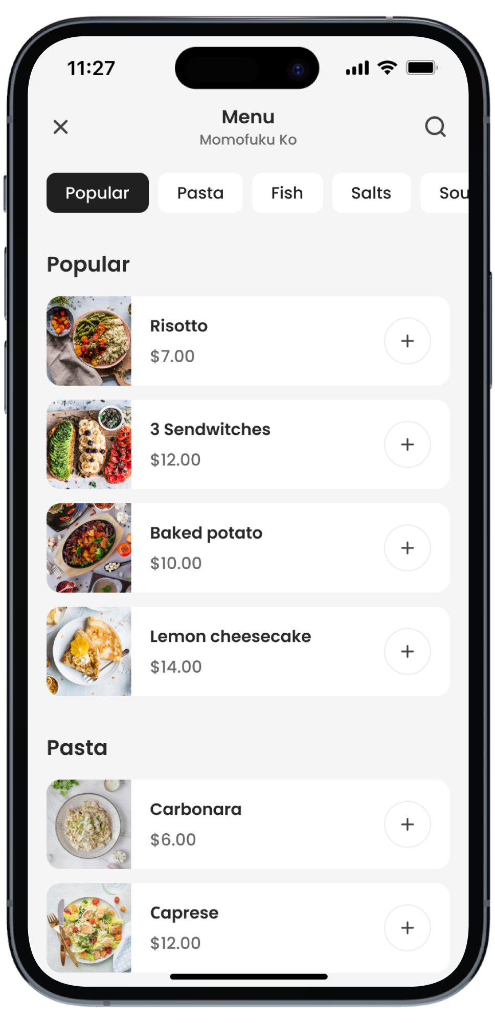
Menu Preview
Look through the restaurant menu before you book a table
-
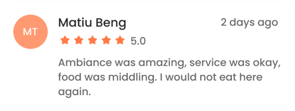
Reviews
You can choose a restaurant based on its reviews
Reservation Proccess
Reserve tables according to your needs and requests
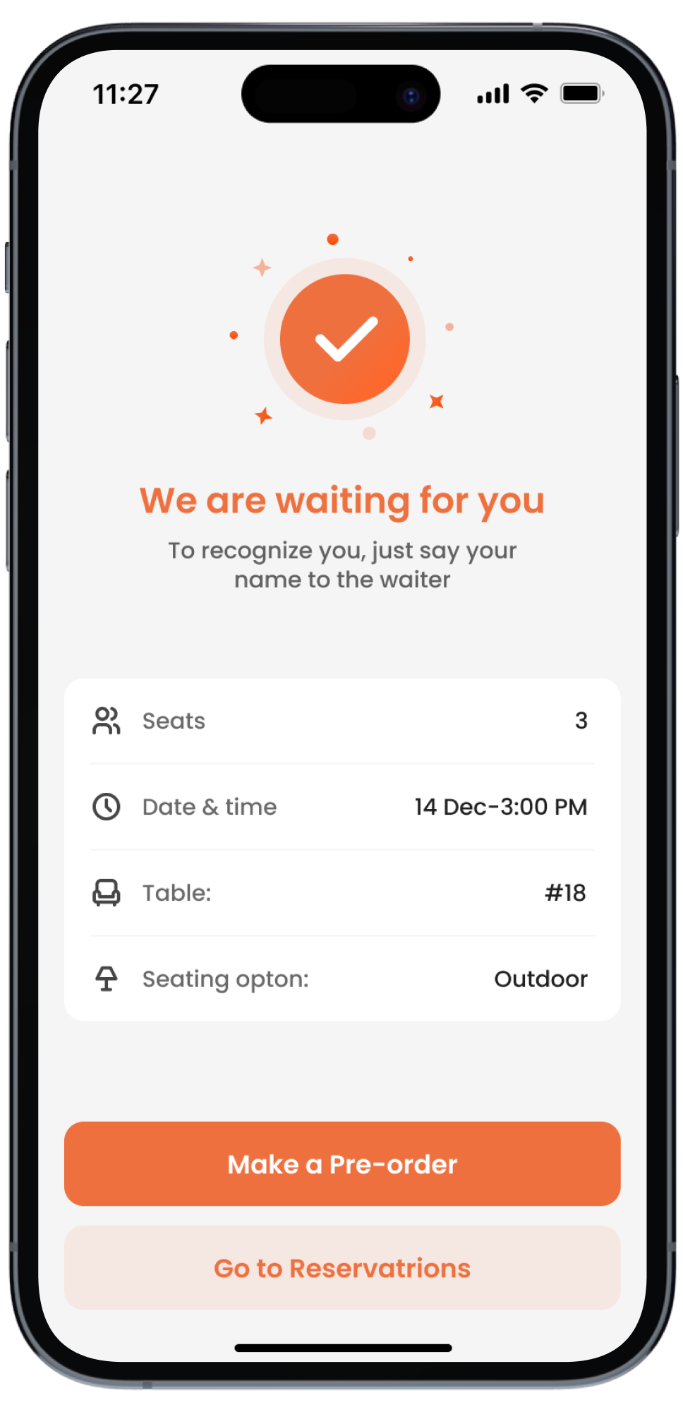
-

Baby Chair
Specify the function of the child seat and the restaurant will prepare it for you
-

Variable Seats
You can choose your own table number and seating
-
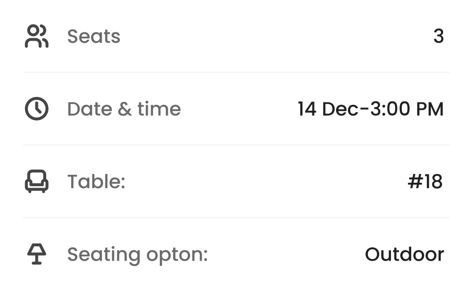
Location
Forgot your reservation date? Find full information about your reservation
-
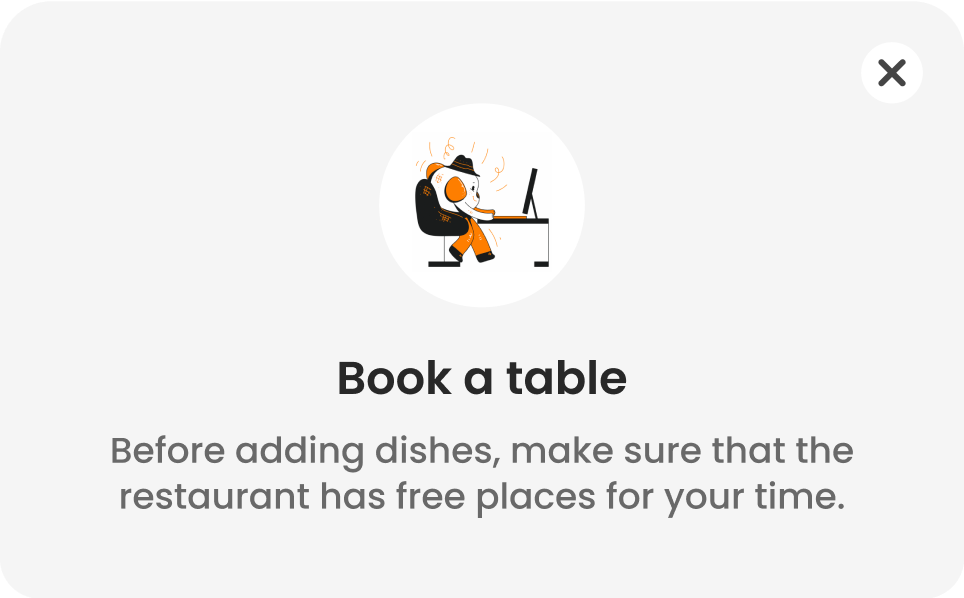
Alert
Before you make a reservation, first check the availability of the restaurant
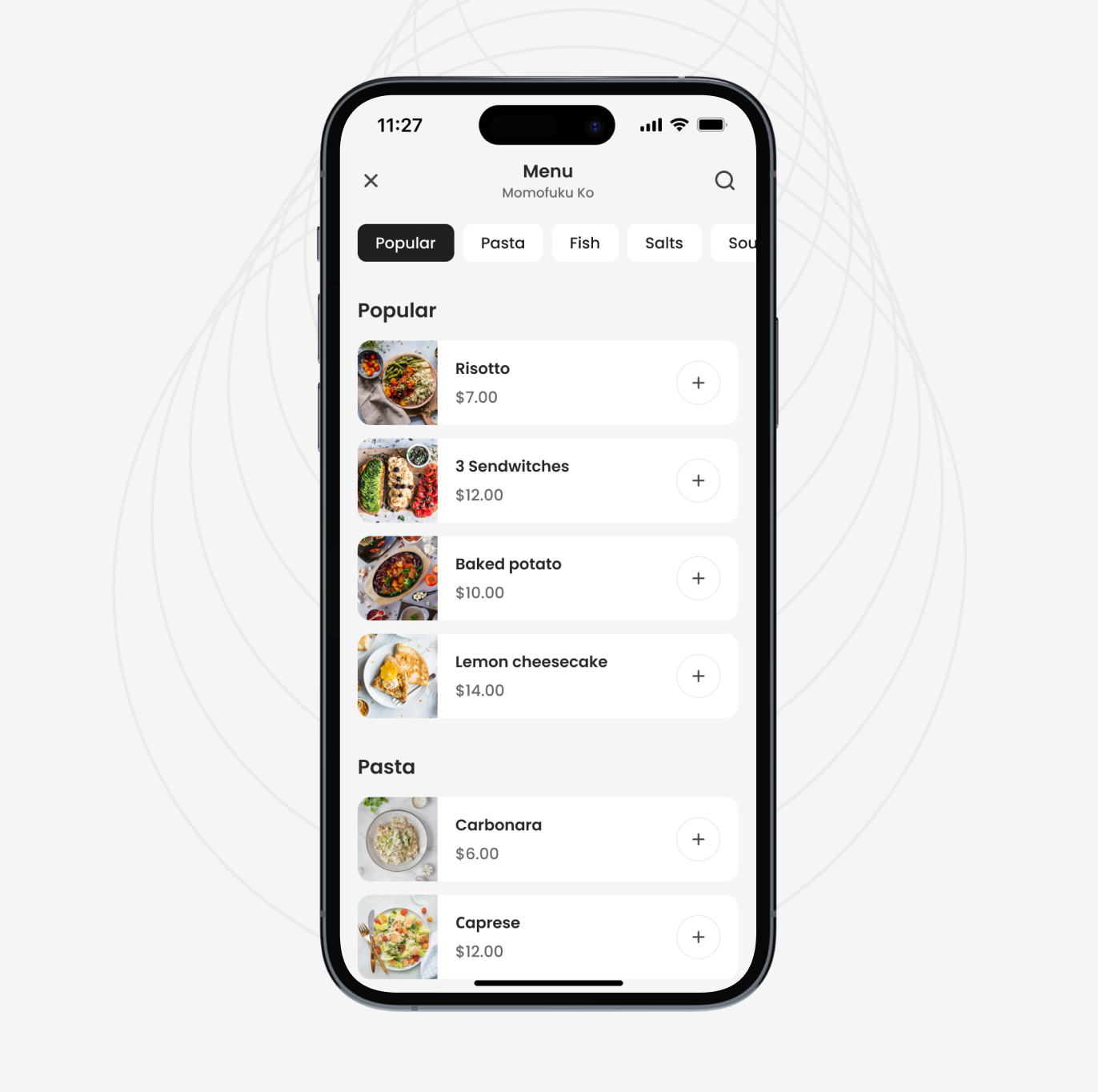
Choose a dish from more than 1,000+ restaurants in your city
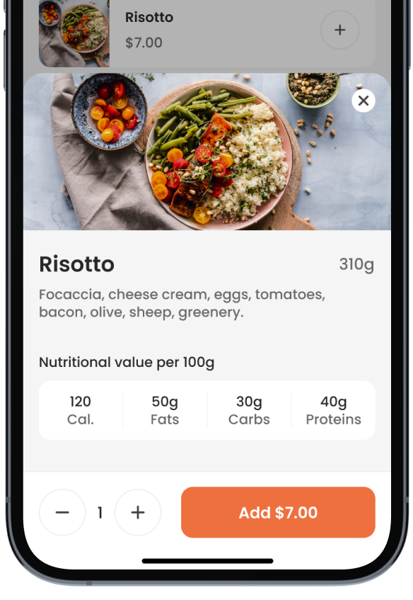
Pre-order your favorite food and come when it's ready
Pre-Order Food
You don't have to waste your time at the restaurant waiting up to 40 mins for your dishes to be cooked. Just order the food you want right in the app. When you come to the restaurant, your food is ready.
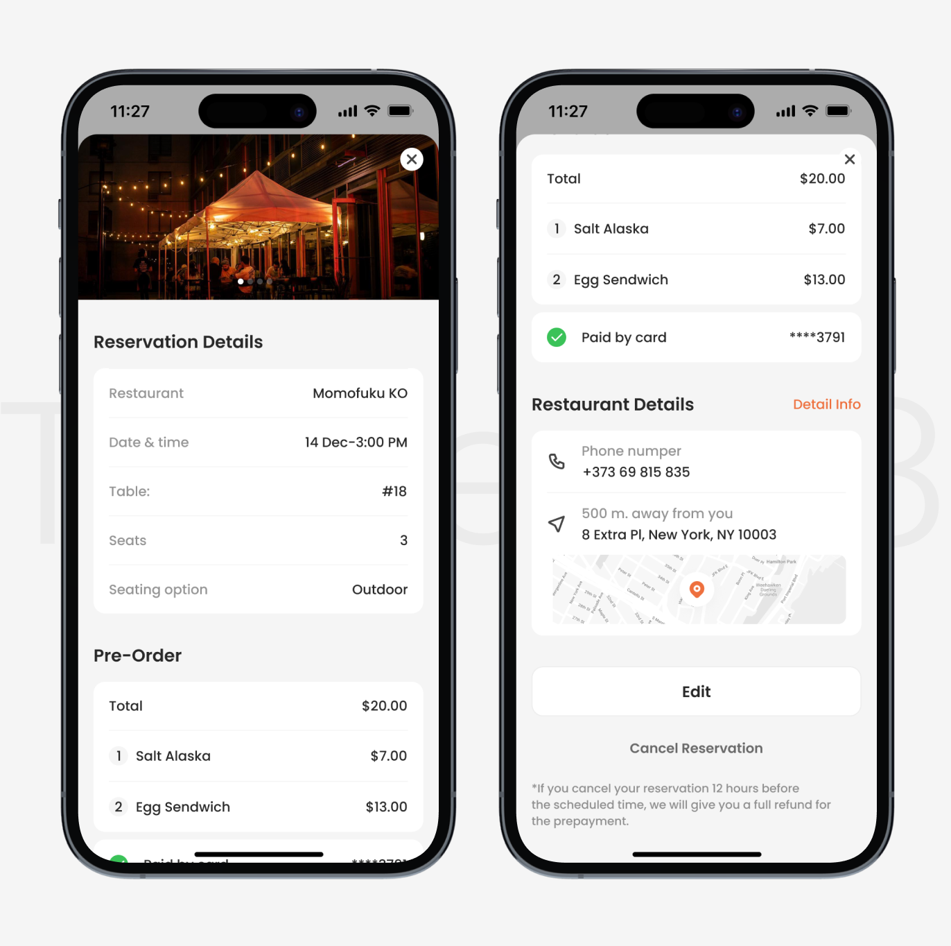
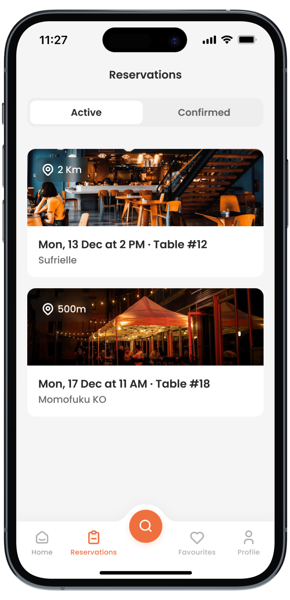
All Reservations
View complete information about reservations
-
01.Research
We analyzed the functionality of more than 30+ food delivery, table reservation, and restaurant apps to understand their strengths and weaknesses and implement the best ideas in OKeeper app.

-
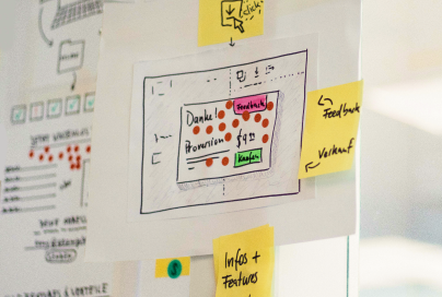
02.Wireframes
We created a UI prototype to see how it would look and function. During the wireframing process, our developers brainstormed different ways users could interact with the app.
-
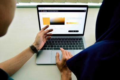
03.Ui Design
Our team focused on creating a visually appealing and user-friendly interface. The process involved selecting colors, typography and interactive elements.
-
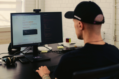
04.Devolopment
This phase began with coding the back-end and setting up databases. Our developers created the front-end design elements, graphics and animations to enhance the UX. The product was tested properly to make sure it ran smoothly on various devices.
-
05.DevOps & Deploy
The phase involved setting up necessary servers, databases, and other infrastructure. Our developers created automation scripts for efficient management and updates deployment and considered security testing to ensure the app was secure. Finally, the OKeeper app was released to users.

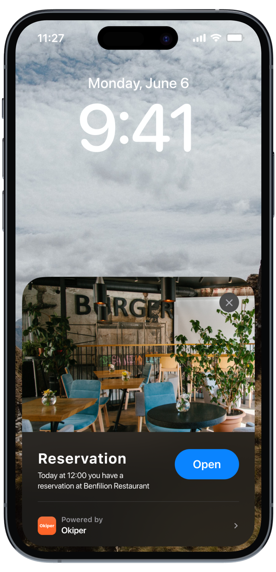
Reservation Alert
We value your time and care about you. We will remind you about your reservation 12 hours before the chosen time.
Favicon & Brand color
The favicon design is simple yet eye-catching. It will be an excellent app representation in app stores.
Orange symbolizes energy, it is perfect for food logos as viewers associate it with citrus fruits.


