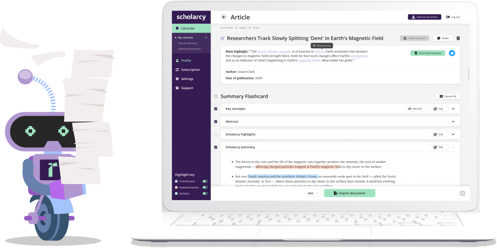

AI-powered article summarizer that helps find key facts faster in any document, article or paper
UX/UI Design for AI platform | Frontend development
About

Challenge
The Scholarcy website was already up and running when
they approached our team. However, it had serious UX issues
for a platform that was designed for thousands of users to interact with every day. The main challenges were a square UX, a long click path and an overall complicated scroll experience.

Goals
The ein-des-ein team strived to give Scholarcy
a new design, aimed at increasing user engagement, simplifying most user actions

Redesign the whole platform and develop the better UX

Create a user-friendly admin panel to manage the system

Create a refreshed look and feel of the service

Develop the new design
with VUE.js

Integrate the new-developed front-end with the AI-based backend
Solution
Improved UX for the platform
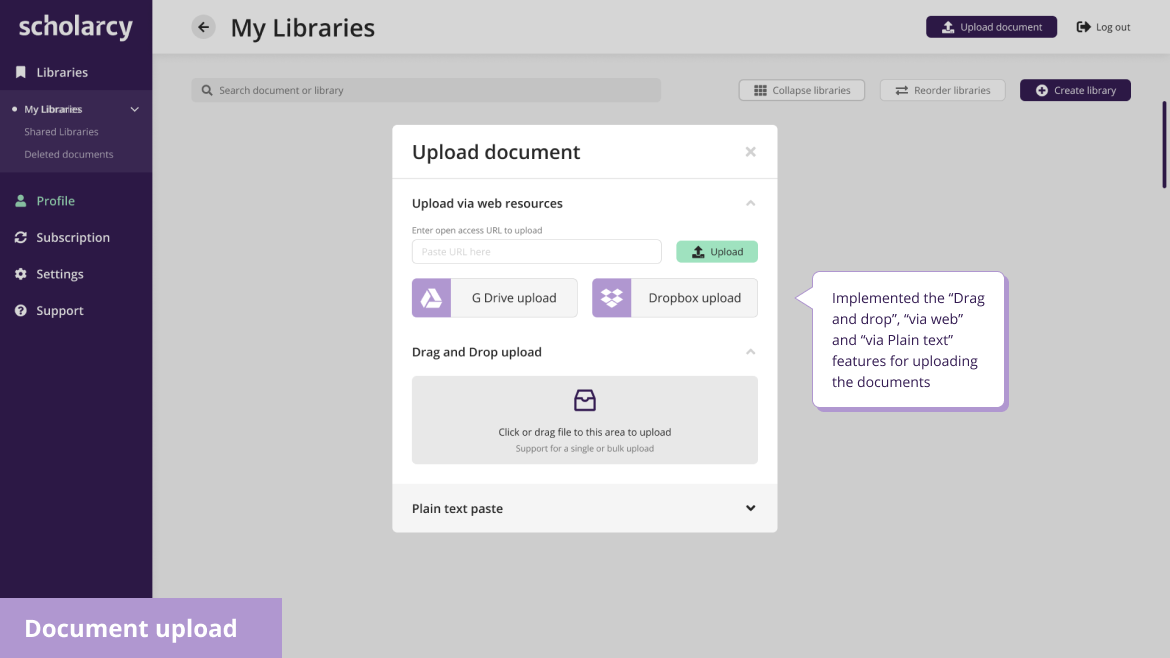
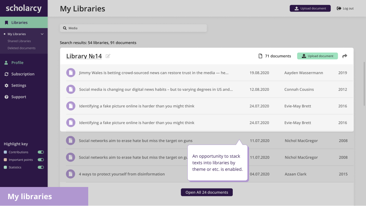
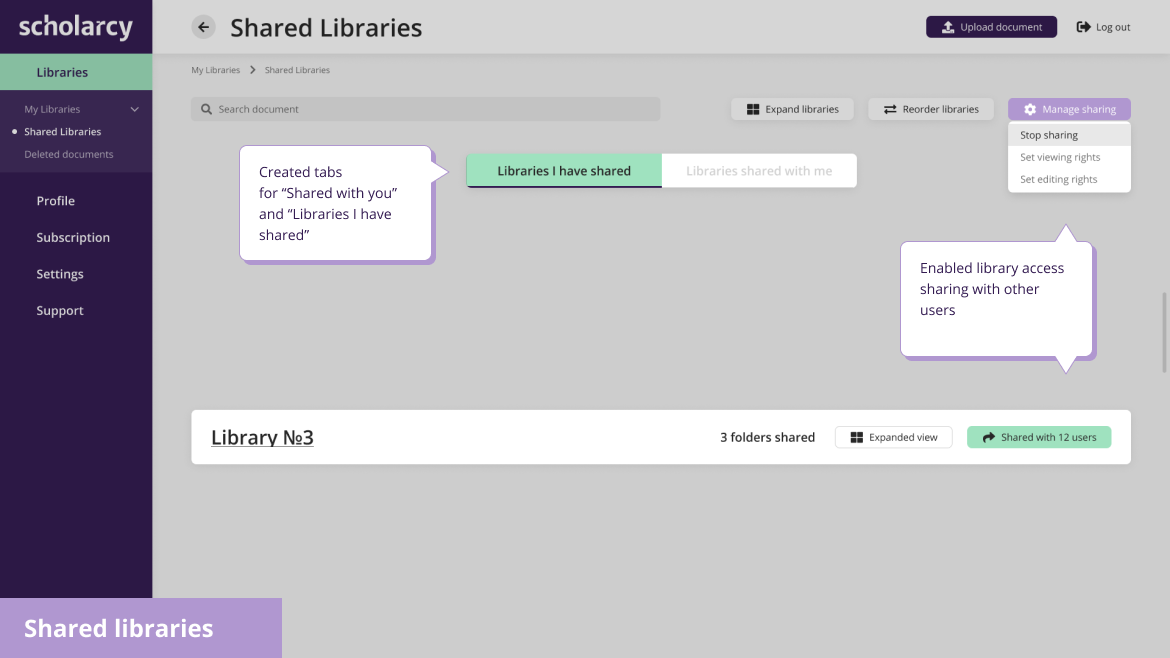
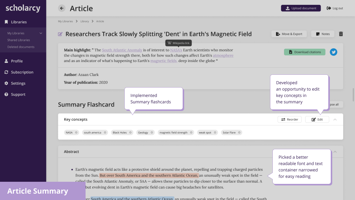
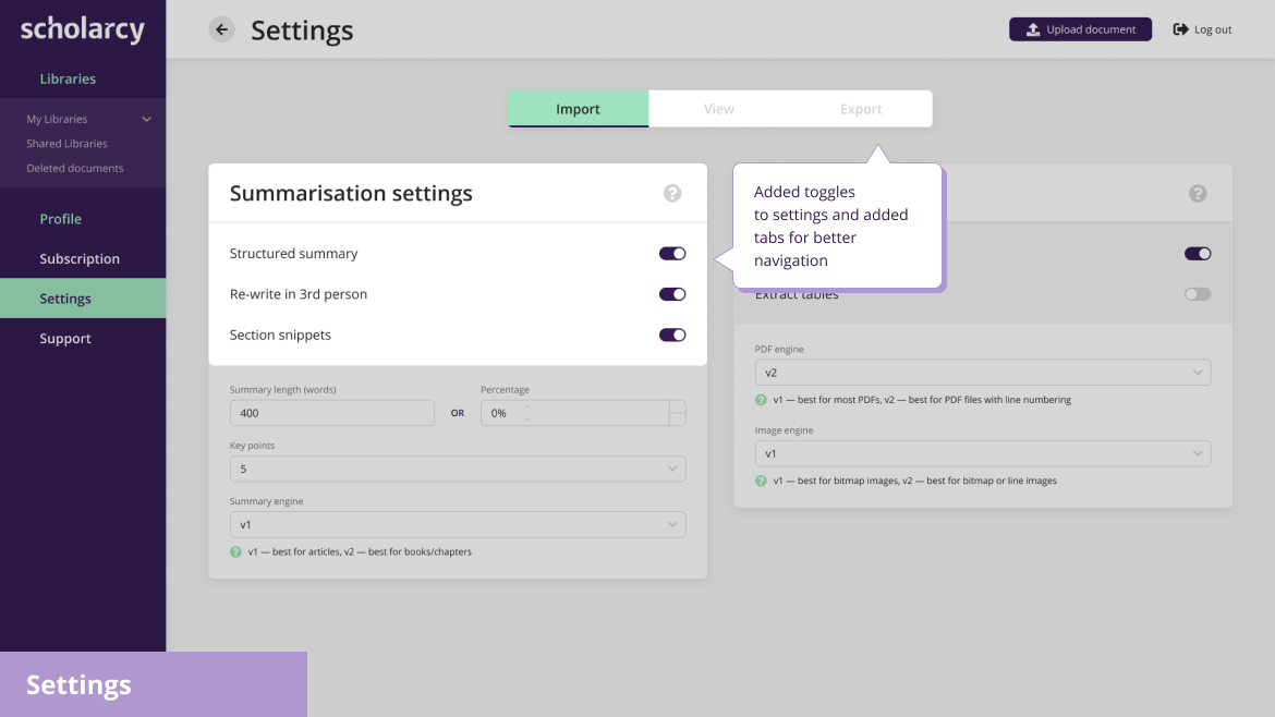
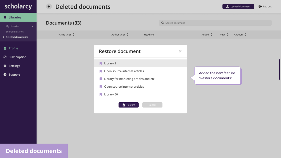
There were a number of improvements to make sure that the UX felt native to the platform and that the user flow felt seamless. Here are some of the main improvements our team worked on:

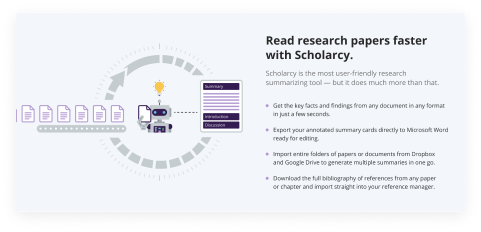
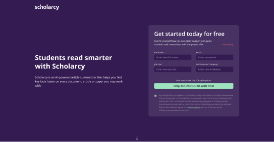
Monetization solution
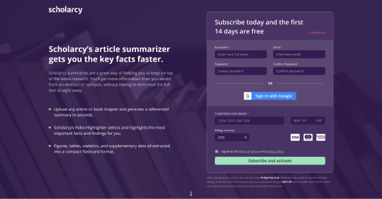
We created designs for B2C and B2B pages, keeping in mind slightly different needs and action points. To strengthen Scholarcy’s monetization strategy, our team paid special attention to the pages where users are prompted to register for a trial or buy a subscription.
Subscription Prompt for B2C
Subscription Prompt for B2B

Frontend development
The team started working with the ready backend of the client,
but there were a lot of issues with the frontend — it had a lot
of inconsistencies and flaws.
The ein-des-ein’s task was to re-think and start the frontend development anew. The team and the client agreed on using
the Vue.js framework — a framework growing in popularity.
Developing frontend was a very important part of the work, since the client had a developer background and gave the team regular feedback to make sure we moved in the right direction.



Redesign of admin panel
After redesigning the admin panel, the Admins now had
an opportunity to create User lists, White lists and Black lists
to easily group users and make important changes on time.
The “Bulk unsubscribe” feature was added as well for deleting
or restricting users on demand.

Brand identity revamp
Our team developed a new mascot logo that was more modern
and fun to look at. We also created animation for social media
and multiple social media assets for the Scholarcy team to use
in their marketing campaigns.




Technology Stack
Interface Design


Frontend Development



Testimonial

Co-founder of Scholarcy
Result
with documents and libraries.Making summaries, highlighting, making selections, sharing
and categorizing became actions that came with ease and through simple navigation.
Scholarcy successfully re-energized their website for B2B and B2C user segments and increased user engagement and retention.

