7 Tips for Creating User-friendly Apps


Why is it important to build user-friendly apps? A growing level of competition on the app market forces developers to constantly improve all user-related indicators in order to not only attract new users but also keep existing ones. The reality is grim—people spend seconds deciding whether they like the product and find it convenient. They can easily dismiss the app if their expectations do not correspond to reality. The result is an immediate decision to delete it and go back to exploring.
One of the common mistakes app owners frequently make is an assumption that potential consumers would actually spend time playing around with the app. Surprise, users do not have the time. Probably, the exception could only be trendy apps like ClubHouse that hit the top charts and everyone wanted to be a part of it due to the exclusivity hook.
That is why proper UI/UX is so important—visitors should easily navigate your application while doing other things like walking a dog or choosing a cereal in a supermarket!
So, what exactly are user-friendly apps? How to implement an intuitive User Interface? How to achieve good UX? In this article, we will give tips to help answer these questions.
Concept of a user-friendly application
Willing to start a new project, both developers and a client should clearly understand what “user-friendly” actually means to set final expectations. Usually, user-friendly mobile apps:
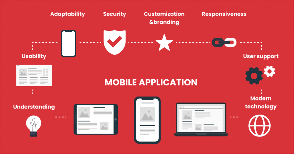
- are easy to navigate and have an intuitive UX;
- have only useful features (logically placed/following each other);
- do not require additional time to understand how any of the features work;
- run smoothly without crashes, bugs, unexpected errors;
- have a good security level;
- have a proper UI and customize the interface for a particular audience;
- are compatible with any device, platform and screen.

To achieve these goals, companies need to keep the described below aspects in mind so the end result would be useful/unique for TA and also cost-efficient for stakeholders.
Top recommendations for a user-friendly application
Tip 1: Develop your application as useful
Proper market research is essential to predict your target audience’s behavior. The first stages would usually include the competitor’s product features analysis along with the customers’ feedback overview. You need to understand the strengths and weaknesses of existing concepts on the market. What is the most useful feature so far? What can you easily eliminate? Why did visitors decide to delete it/switch to other available options? Focus groups would be an even better idea but if you have limited budgets, analyze existing feedback online in the Apple Store or Google Play market, search for recommendations, read forums, study-related articles.
Moreover, you should personally download these programs to see examples of poor UI/UX decisions and pick up on excellent ideas as well. But do not make a final decision taking only your personal thoughts into account. Once again, you bring the idea to life to satisfy your target audience so their opinion is critical!
Tip 2: Hire professionals in app development and design
Make sure to find the coolest agency with excellent (and proven!) experience in mobile application development and related services. Good companies know a lot about current trends, they do such market research on a daily basis so you would avoid possible mistakes and additional time/money spending. Besides that, professional designers would use their expertise to recommend eliminating or/and adding some features you have never taken into account before and help choose the best security, payment, and delivery solutions.
Of course, it may cost more than you have expected at first, but is the risk of releasing a useless complicated app worth investing in at all?
By the way, to better understand this aspect, check out our article “How much does app development cost?” in our blog.
Tip 3: Make Intuitive User Interface
Once you complete the research step, a design team can start working on a basic wireframe (a prototype). They will clarify where all the app elements should be to achieve the first easy-to-use variant. This process involves all key specialists (product managers, designers, developers, etc.) and a client company to define functionality needs and expectations.
Based on it, you are able to analyze a user flow or steps visitors would make within the app (for example, if it is an e-commerce project, a path from the main page to actual order confirmation). It is efficient to design a user flow in order to better understand how people would navigate through your application. Interviewing potential audiences is a great way to find out if a current prototype is intuitive enough and the final option would be easy to use.
Once again, during the market research, you should analyze existing concepts (similar to yours) to «borrow» some great solutions to implement in your project (don’t copy, just get inspired!). Open the competitor’s application and figure out what features really annoy you or take additional time to comprehend so they are not intuitive. How can you solve the existing UI problem? Similarly, highlight good existing solutions when your finger already «knows» where to tap.
Tip 4: Use UI/UX app’s design best practices
Once you finish with the wireframing step, it is time to start the design process. Speaking about this step, designers usually mention its two main elements:
User Experience (UX) Design
UX is not only about functionality, it combines all aspects/emotions people are experiencing while they are navigating an app. For example, if a visitor fills a callback form on the website and doesn’t get a call from a customer support manager eventually, it is a sign of bad UX! You could also describe it as an overall impression from a product depending on its architecture, graphic elements, clear content, responsiveness, etc.
Even if you have done a prior extensive audience behavior analysis, you should always keep the following questions in mind during EVERY development stage:
- How does my app solve TA’s problems?
- What are the pain points of my TA?
- What user stories may happen?
- Does this element/feature cover people’s needs, meet their expectations?
User Interface (UI) Design
It’s definitely one of our favorite parts since we are solid fans of UI. Our aim here is finally to get a nice-looking functioning version based on TA’s preferences/behavior/current trends. UI actually contains not only graphical but also voice-controlled and gesture-based formats. For example, speaking about the graphical part, the goal here is to add proper animations, high-quality illustrations, and slides. Buttons, fonts, and color schemes are part of the UI design, too. Involved designers’ aim is to ensure that:
- Icons help visitors with the navigation, images match its perception, they don’t distract people from the main aim;
- Place «Add to bag», “Order”, “Start” etc. buttons in a logical way;
- Text content/descriptions are clearly visible from all devices;
- Pop-ups, animated menu parts and other elements work correctly, etc.


There are a lot of surveys where scientists test how different color schemes may affect visitors’ behavior online. For instance, people often associate the green color with positive actions («Buy», «Enter», «Yes» button) and red with negative ones («Cancel», «Delete», «No» button, etc.). Usually, we don’t even pay attention to writings on a particular button and click intuitively – that’s what UI design is all about.

After that, do not forget to test if your TA actually likes final visual elements (chosen brand identity+usability solutions, layout, fonts, etc.). Great if it is possible to provide your focus group with multiple color options, fonts, schemes so they could choose what they like the most.
How to achieve an awesome result? Study the latest UI trends (or ask specialists who provide mobile app design services on a regular basis), follow «Pantone» on Instagram, analyze competitors’ choices, read popular blogs, etc. to choose the best possible options for your project.
Tip 5: Take care of the security
The more user-friendly apps are launched every day, the more scammers want to benefit from them. We can not change this fact but we can protect sensitive data better from being stolen and also the company’s reputation. Dangerous and cheap tools do not equal user-friendly!
If you have in-app purchases and require card details, it is vital to cooperate with the best PSPs. Get an SSL certificate to prove you are a safe place to buy goods from. Moreover, ensure your servers are also secured well: encrypt data, install real-time threat detection tools. You cannot guarantee the quality of the code taken from a third-party library so check it properly to prevent any sensitive data leakage.
Do regular penetration testing (also known as ethical hacking) to search for security weaknesses. Look for ways to notice the vulnerabilities, and constantly improve to increase the security level.
Make it easier and safer to log in by integrating Google, LinkedIn, or Facebook login options. Such a solution puts all data protection issues on other company’s shoulders, their enormous security department. Plus, there is a nice bonus: consumers start using your application right away with no need to additionally register and fill a ton of required fields. The less your application takes to start using, the better!
Tip 6: Use proven development technologies
Choosing the right technology is one of the most important decisions as it directly affects the usability indicators. Among the top ones, we need to mention the following:
Java
If you are creating an Android project, Java should be a pretty obvious option as it offers open-source libraries and great community support. Not to mention it is a highly secure language. Telegram messenger probably wouldn’t be this cool without Java!
Kotlin
Known as «a modern variant of Java», this cross-platform general-purpose language lets you develop advanced mobile apps. Trello made a wise choice to use it, because Kotlin is considered rather safe, clear, and has great support. This is a great option for building Android apps.
React Native
An open-source framework is widely implemented for cross-platform web, iOS, Android apps development. Airbnb is a famous RN-based project!
Swift
A general-purpose language was developed by Apple for their macOS, watchOS, tvOS platforms. Works with Cocoa and Cocoa Touch frameworks and C, Objective C codes written to easily develop iOS applications. LinkedIn was born with the help of Swift!
Python
This language is known and adored globally, and developers use this language to build all kinds of mobile apps. Python is a kind of celebrity among programming languages. Instagram and YouTube are successful examples of solutions built on Python.
Flutter
Thanks to Google corporation, developers often use this open-source mobile development SDK for developing great cross-platform applications. Why are solutions such as Flutter so popular nowadays? Because sometimes native applications can be a bit costly for some and developers like to use cross-platform solutions to cater to multiple devices. For example, the Chinese giant, Alibaba, was built with the help of Flutter.
Tip 7: Integrate ready-made systems
We are talking about the cases when young startuppers want to pay less and «reinvent the wheel». For example, develop a specific feature or functionality by themselves instead of paying for a ready-to-use solution. However, it takes less time and money to eventually integrate a payment gateway, a chatbot, or other common app necessities. You are not only providing visitors with tools they already know and like, but you also don’t waste time on useless processes so you release the app quicker. This is a win-win situation!
Wrapping it up
To sum up, it is essential to make sure your app is really useful and desirable and you have research to back it up. Make sure you are cooperating with the trustworthy development professionals in the industry, choose the most appropriate and up-to-date programming language, and go all the way when it comes to UX/UI design. Some companies slightly overlook the design part, but it’s equally important! Decide what color options and branding elements would be the best for your brand to represent your purpose and uniqueness.
Always test achieved results on every stage to make sure you somewhat reached your target audience’s expectations. A basic wireframe will help you decide what elements should be added or what is left out. Think about UX systematically, considering not only actual interaction with features but also customer care, fast checkout, convenient delivery options. Assure people that their personal info is well protected and choose well-known tools for that.
And, of course, do not be afraid to introduce an already existing but improved concept! There is always a place for fair competition and you never know what opportunities are still available to make your consumers’ life easier.

We hope you’ve found this article about user-friendly apps interesting. If you’d like to talk to us and estimate your app idea for free, click on the banner above or reach out directly to contact@ein-des-ein.com.


